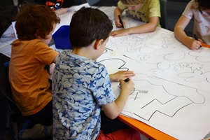
The Creative and Brand Team then took the children’s artworks back to their studio and set to work, scanning the drawings into computers and fitting them together to come up with a composition the team was happy with.
“We utilised the various textures and marks and explored how they could be magnified but retain their authenticity. We blew them up really big and came up with a range of compilations, which are laid out around the building to work in with the different coloured floor tiles.”
Katie says because Te Awe Library has one of the larger children’s collection of all the Wellington libraries, it made sense to have kids at the heart of the project.

Creative and Brand’s Design Lead Chris Mitchell says it was a delight working with the youngsters.
“They were spontaneous and inquisitive, and they offered a unique perspective. They brought a neat interpretation and there’s a nice parallel between their positivity and the new space.”
Chris says the new library, which opened in July, provided an opportunity for his team to try something a bit different.
“We often collaborate as a team, but to get out there and engage with the community – especially young people – was something really new and exciting for us. It just felt right for this project.”
He says it was a rewarding experience for all involved and it is humbling to have the project selected a finalist in the Best Design Awards, which are being held on 13 November.
“For our design team, the variety of work we get to undertake is incredible, but we’re incredibly lucky to have been able to work on a project like this. It’s lovely to now be back in the library with people using the space, surrounded by this collaborative artwork and the atmosphere it’s created.”